
Timeline
Jan 23’ – May 23’
(4 months)
Team
5 UX Researchers
1 Senior UX Designer
1 UX Design Intern
1 Software Engineer
Platform
Web
EagleView Assess
Tools
Usertesting.com
Qualtrics
Mouseflow
Google Docs
Microsoft Teams
Paper & Pen
My Role
UX Researcher
Usability Tester
Deliverables
Heuristic Evaluation
Test Plan
Usability Testing
Design Recommendations Presentation
Problem
Usability gaps slowed critical inspection workflows.
Impact
Improving UX supported faster, more confident decisions.
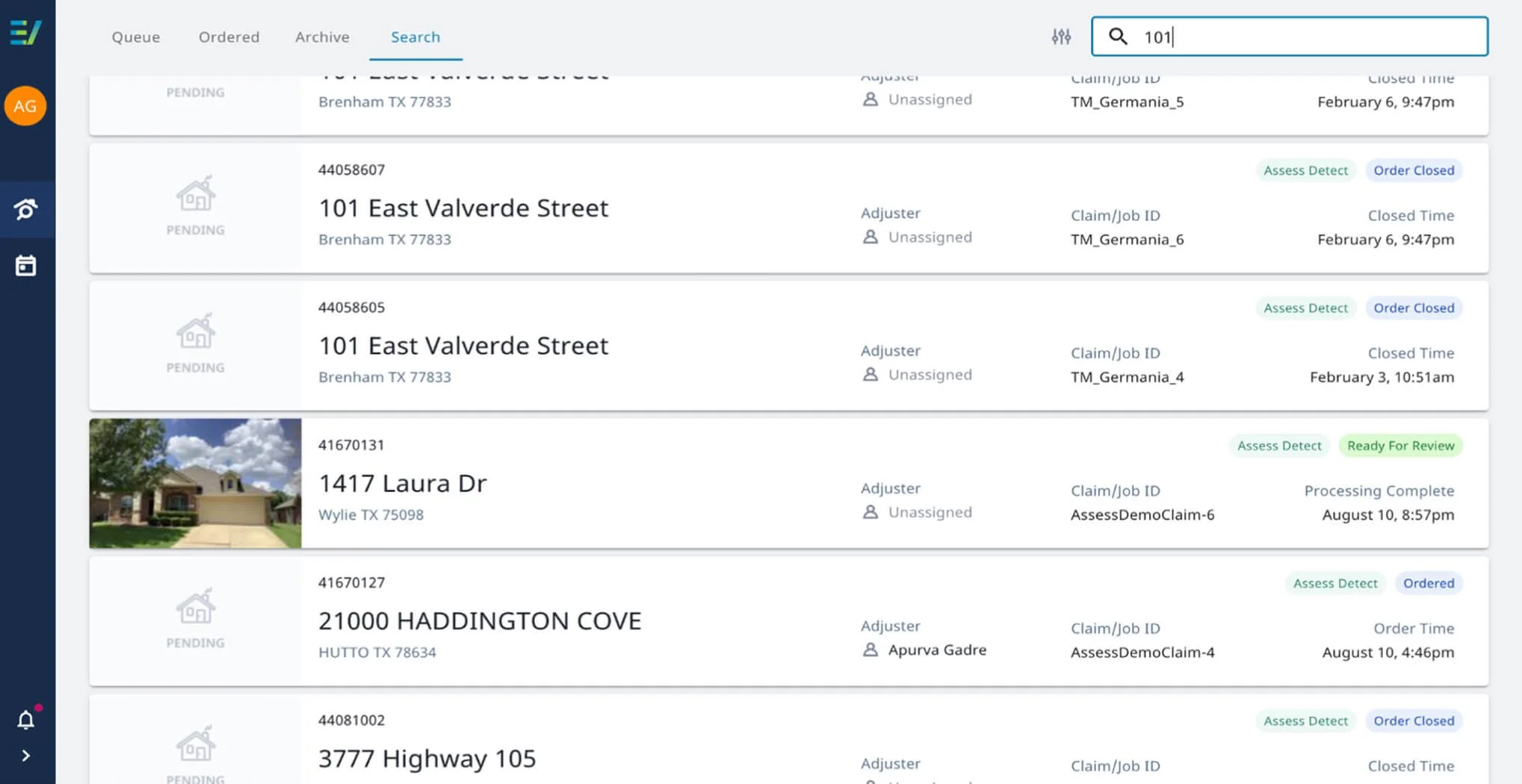
EagleView Assess supports time-sensitive roof inspections, but inconsistent interactions, unclear feedback, and inefficient workflows increased cognitive load, slowed inspections, and made errors more likely.
The recommendations helped create a more intuitive inspection experience by reducing unnecessary effort and improving task efficiency. For EagleView, these changes supported quicker claims processing, fewer usability-related errors, lower training overhead, and greater confidence in adopting the platform before launch.
1.5x
20%
More insurance claims resolved per day.
Reduction in loss adjustement expenses.
Solution
Research translated into actionable product improvements.
I combined heuristic evaluation with usability testing involving 6 experienced insurance adjusters to uncover 13 high-impact usability issues and deliver prioritized recommendations.
Background
An AI-powered inspection platform for insurance claims.
EagleView Assess™ is an AI-powered drone inspection platform that helps insurance adjusters remotely inspect roofs and assess damage. By combining autonomous drone imagery with computer vision, it enables claim decisions while reducing the need for manual roof inspections.
Problem Area
Assess's UI surfaced usability issues across the inspection workflow.
Several interaction and feedback issues surfaced throughout the UI of the Assess tool — from search and navigation to damage classification and system feedback. Together, these pain points increased cognitive effort, slowed inspections, and reduced user confidence in high-pressure claim workflows.
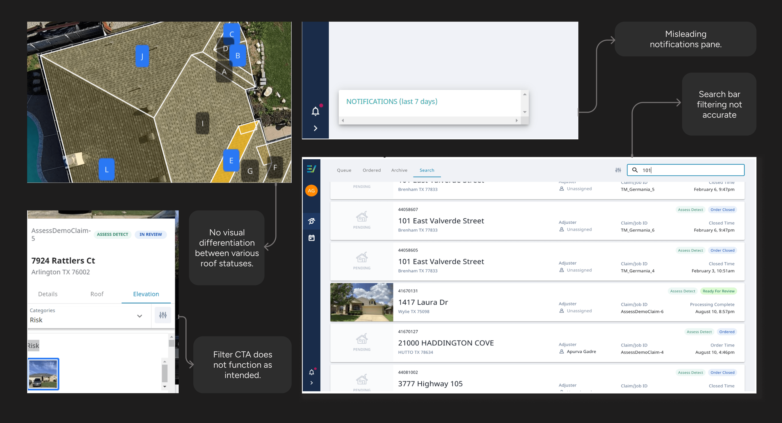
Example gaps with the UI of the Assess tool
Implications
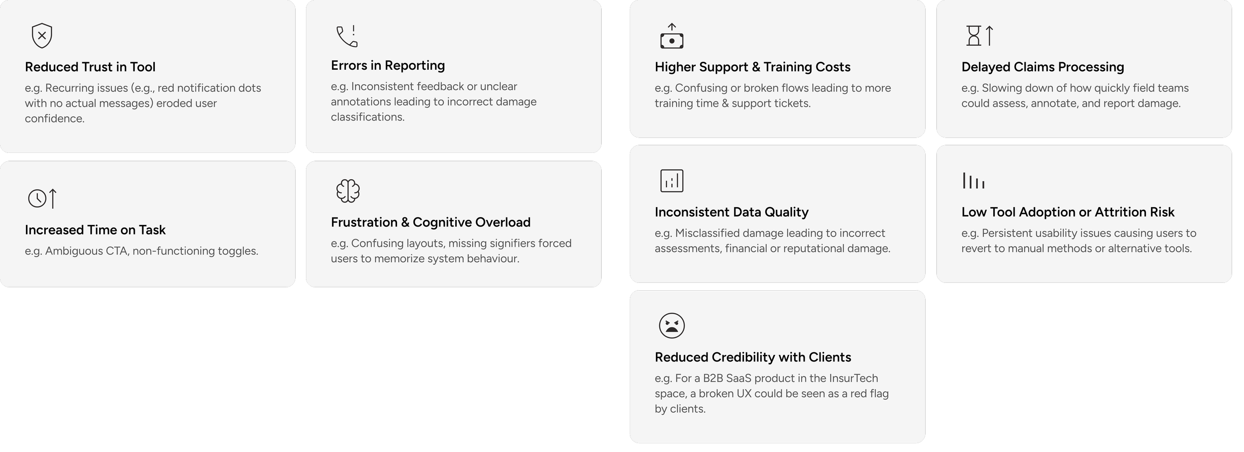
The cost of poor usability.
Implications for the Users
Every usability gap introduced friction into a workflow where speed and accuracy directly influenced claims outcomes.
Implications for the Business
Goals
What success looked like
At kickoff, our team aligned with EagleView on the product's real-world use. Success meant enabling adjusters to complete inspections efficiently, minimizing usability-related friction, and ensuring the product could support EagleView's business goals before launch.
The business objectives were :
Increase inspection efficiency for insurance adjusters.
Accelerate claims processing and reporting.
Reduce training and support overhead.
Improve adoption of the Assess platform.
Deliver a reliable, enterprise-ready user experience.
The Design Challenge

How might we improve the usability of EagleView Assess™ to help insurance claim managers and roofing contractors more efficiently navigate the tool & generate reports with greater ease and accuracy?
Research Approach
Combining expert evaluation with real user feedback uncovered both usability flaws and workflow friction.
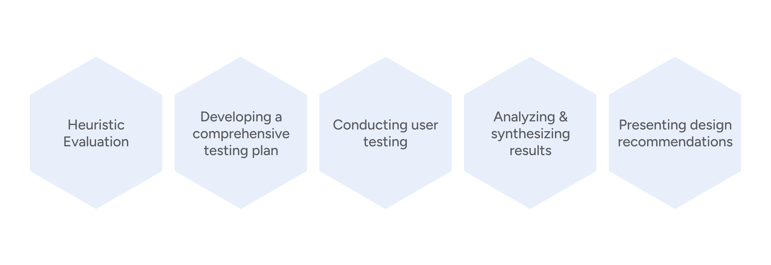
We paired heuristic evaluation with moderated usability testing to evaluate Assess from two perspectives. The heuristic evaluation identified interface issues against established usability principles, while testing with experienced insurance adjusters validated how those issues affected real inspection workflows and business-critical tasks.
1. Heuristic Evaluation
Goal
2. Usability Testing
Findings
Identify surface-level issues.
13 Total
6 High
5 Medium
2 Low
Approach
✦ Evaluated Assess using NN/g usability heuristics.
✦ Prioritized findings by severity.
✦ Produced actionable recommendations.
Goal
Method
Identify deeper workflow issues by observing real task behavior.
✦ Moderated task-based testing
✦ Think-aloud protocol
✦ Post-task interviews
Participants
6 experienced insurance adjusters
Data Collected
Qualitative
User frustrations
Satisfaction levels
Feedback on task difficulty
Quantitative
Task completion times
Number of errors
Success rates
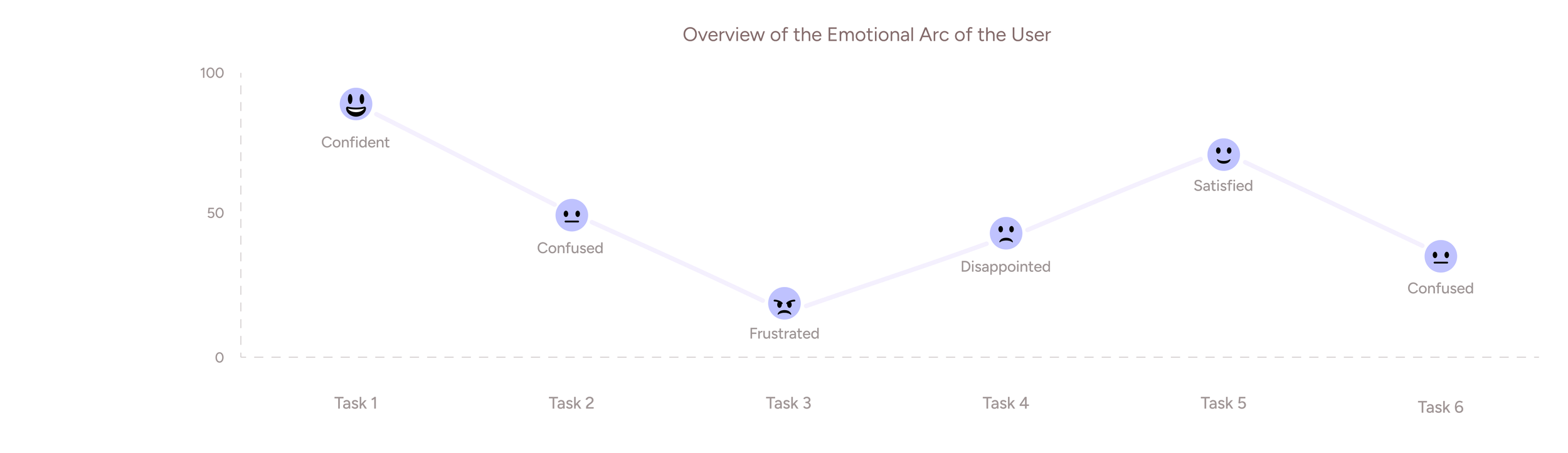
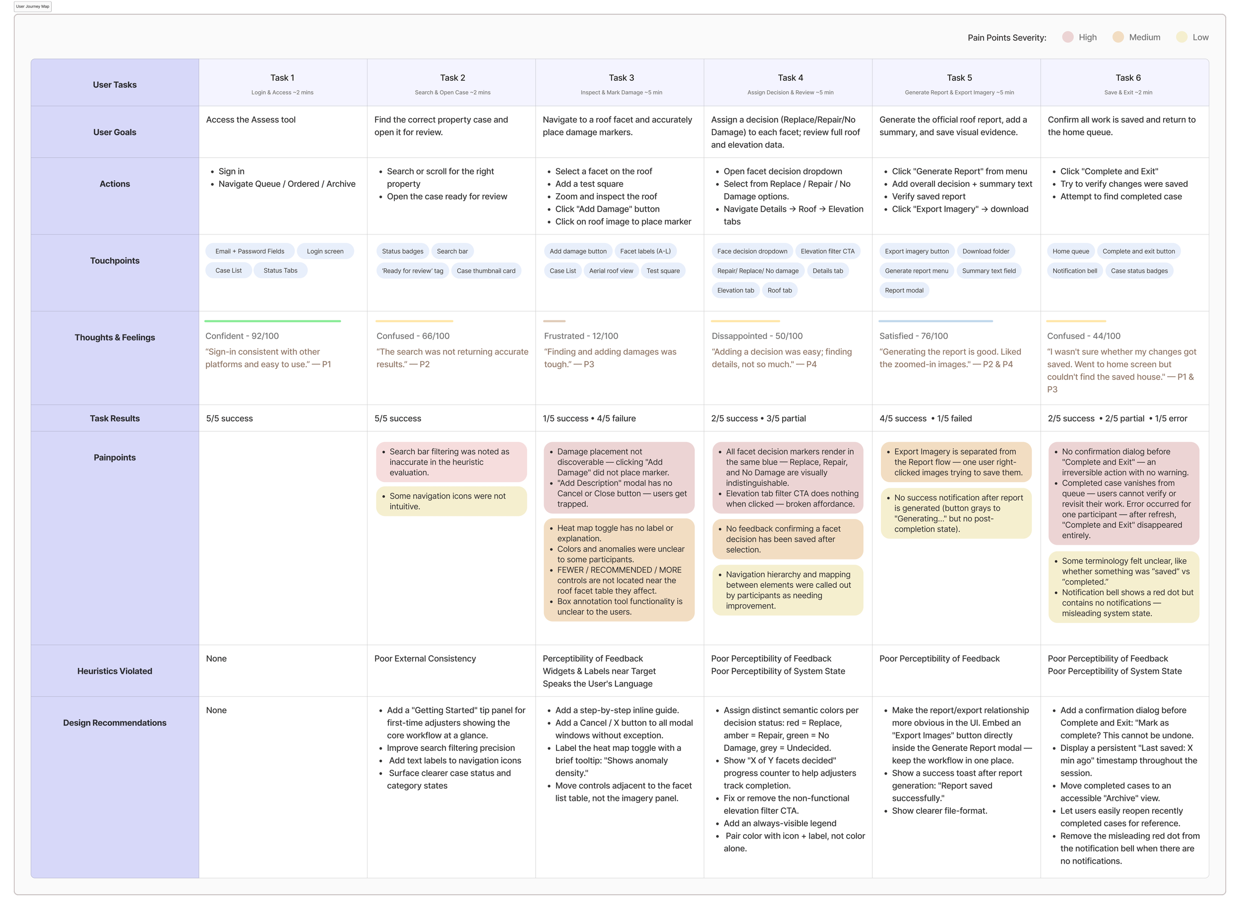
Analysis: User Journey Mapping
Connecting isolated issues into one workflow.
The journey map connected findings from the heuristic evaluation and usability testing into a single workflow. Mapping the adjuster's workflow helped us see where usability issues compounded across tasks. It revealed the highest-friction moments and guided us in prioritizing recommendations with the greatest user and business impact.
Design Recommendations
Turning research insights into actionable improvements.
1. Damage display options were too far from the target area
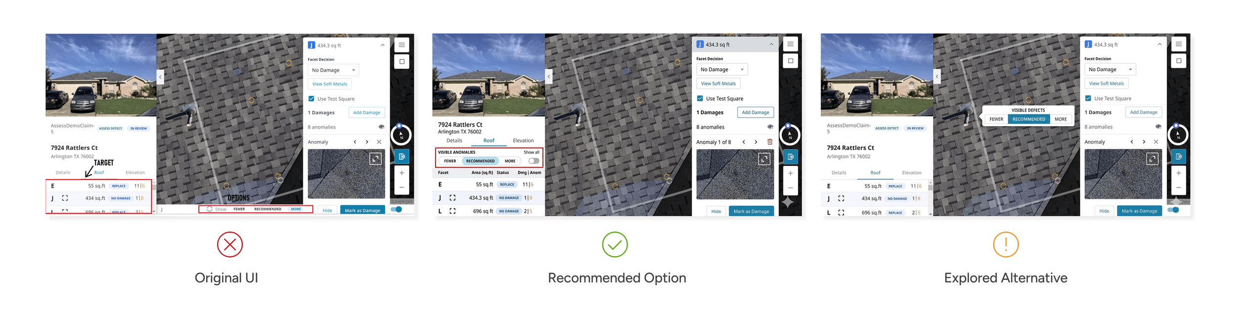
Problem
Controls were detached from the working area
This feature helped adjusters filter visible damage markers on the roof. The “Fewer / Recommended / More” toggle helped them control how much detail they want to see, which is essential when validating a claim.
Impact
The placement forces users to shift focus across two separate areas increasing cognitive load and slowing down task completion.
I translated the research findings into focused design recommendations that addressed the highest-impact usability issues. Each recommendation was designed to improve task efficiency, reduce user uncertainty, and strengthen the overall inspection workflow without requiring a complete product redesign.
Recommended Option
Group Controls with the damage table
I recommended grouping the controls with the damage table to reduce screen scanning and make the interaction more intuitive. This improved contextual clarity without adding extra steps, though it required tighter use of side-panel space.
Expected Impact
Lesser time on task.
Decrease in cognitive load
Explored Alternative
Surface controls as an in-canvas toolbar
I explored an in-canvas toolbar to bring controls closer to the active area, but it was not selected because it introduced more visual clutter and could obstruct inspection imagery. Option A offered a better balance of efficiency and clarity.
2. System errors lacked enough guidance for recovery
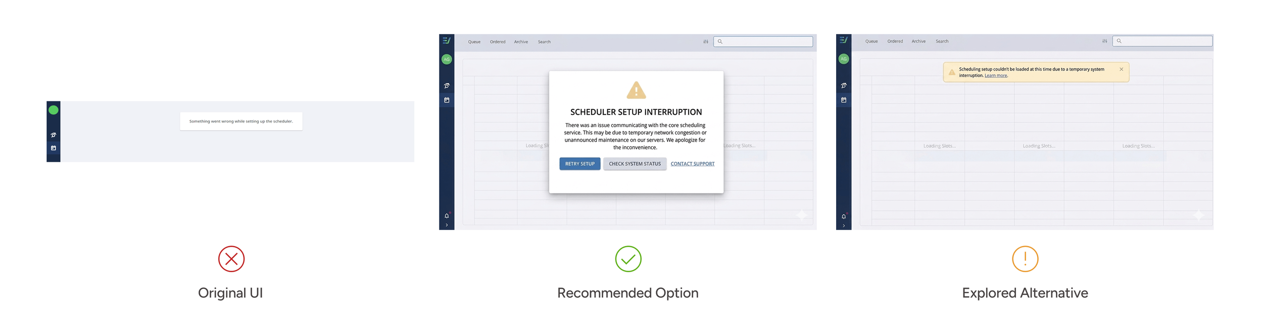
Problem
The error message explained the failure but not the recovery path
The Assess Scheduler helps adjusters remotely initiate inspections, but when users tried to access it, the system displayed a vague error message that did not explain what went wrong or what they could do next.
Impact
Left users confused and stuck.
Recommended Option
Add a clear recovery path with next steps
We recommended rewriting the error state to explain the issue in plain language and guide users toward recovery through a retry action, troubleshooting tip, and a help link. The tradeoff was that it required a slightly larger error component.
Expected Impact
Reduced user frustration.
Trust in the system's reliability.
Minimized reliance on customer support for recoverable errors.
Explored Alternative
Keep the message lightweight with a compact in-line alert
We also explored a lighter inline alert that preserved screen space, but did not choose it because it still relied too heavily on users interpreting the issue themselves. Option A offered clearer recovery support at a moment of high uncertainty.
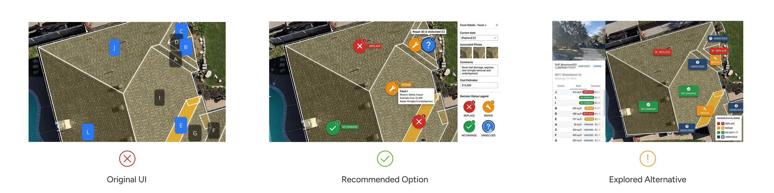
3. Roof status options lacked clear visual differentiation
Problem
Different roof statuses looked too similar at a glance
Insurance adjusters use the 'facet decision' feature to mark and categorize the condition (Replace, Repair, No Damage, Undecided) of each roof section.
The “Undecided” status was gray, but all other statuses—Replace, Repair, and No Damage—were the same blue color, offering no quick way to tell them apart.
Impact
Increased time on task
Increased probability of errors
Caused user frustration
Recommended Option
Use distinct status colours with supporting labels
We recommended assigning a unique, accessible colour to each decision state and pairing it with compact labels and a visible legend. This made statuses easier to distinguish at a glance, reduced ambiguity, and better supported quick decision-making during time-sensitive claim review.
Expected Impact
Shorter time on task
Reduction in user errors caused by status confusion
Higher satisfaction levels due to easier visual recognition
Explored Alternative
Surface decisions through a table-led view with supporting on-canvas labels
We also explored a direction that relied more heavily on the side table and secondary on-canvas labels. While this improved structure, it made the workflow feel denser and required more back-and-forth visual scanning, so we did not choose it as the primary solution.
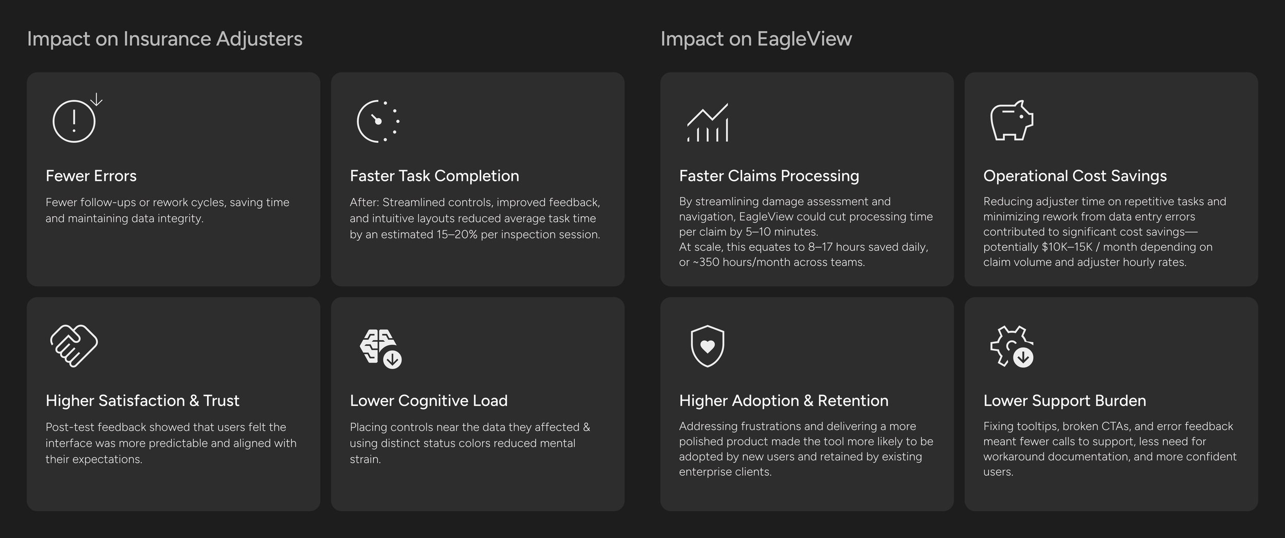
Impact
The impact went beyond usability.
The design recommendations leading to improved UX strengthened both task performance and product value. The impact it had is as follows:
Reflections & Learning
✦ I learned that strong UX in enterprise tools often comes from solving small moments of friction.
This project helped me see how much impact seemingly small interface decisions can have in a fast-paced, high-pressure workflow. It pushed me to look beyond surface-level usability issues and think more deeply about confidence, task flow, and the kind of feedback users need to keep moving without second-guessing themselves.
Next Steps
✦ Testing the redesigned experience
I would love to conduct another round of usability testing with insurance adjusters to test the implemented design recommendations. Comparing the updated experience against the original workflow would help measure whether the changes improved task completion, reduced confusion, shortened time on task, and increased confidence across key inspection tasks.