Thrive
Product Design • FinTech Concept App • 15 Weeks
TLDR;
Personal finance management in one place.
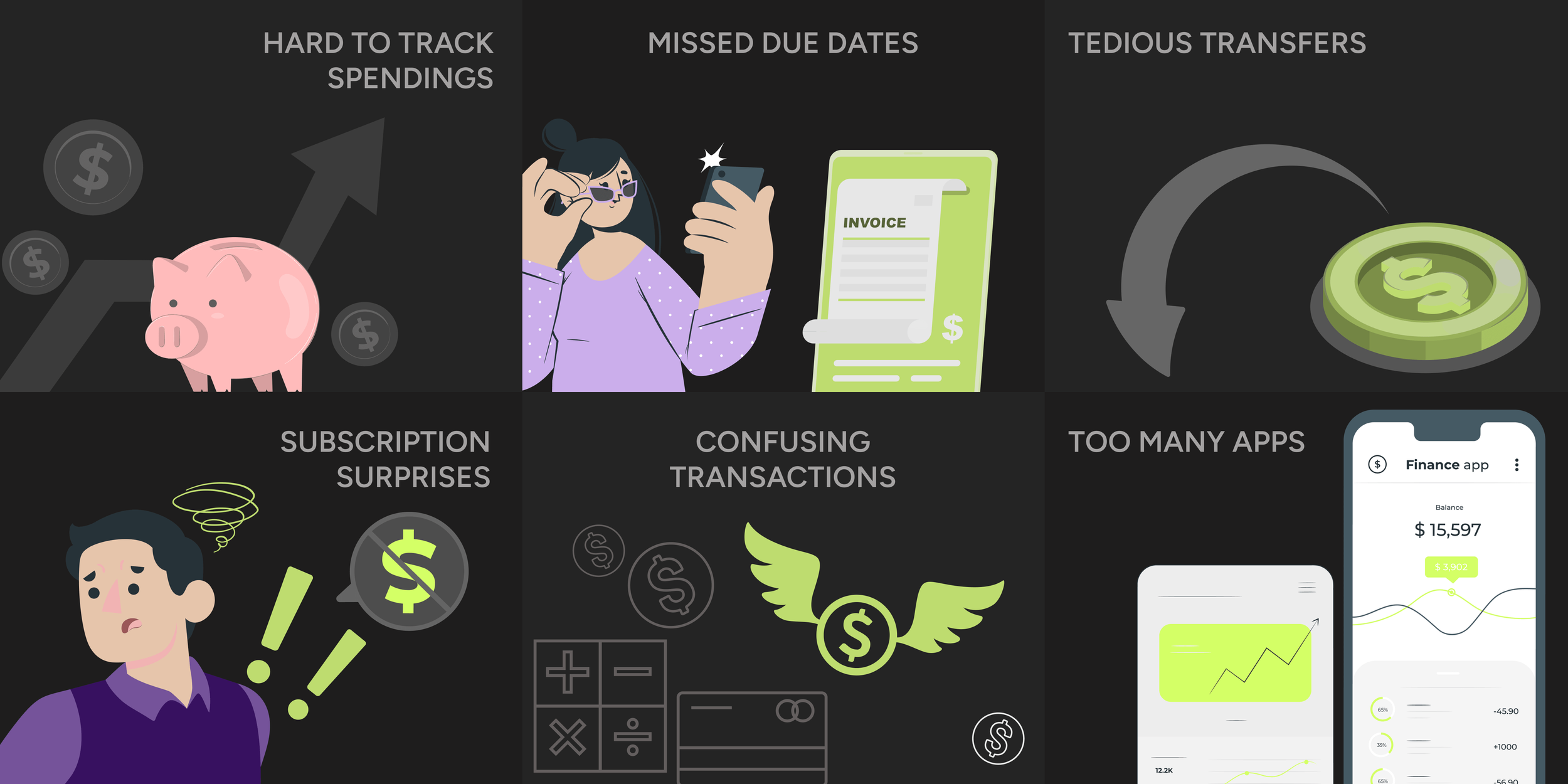
People juggle with multiple apps to manage their banking transactions, check balances, track spending, and move money—so their financial picture ends up fragmented and hard to manage. As a result, users miss due dates, lose track of subscriptions, and spend extra time hunting through transactions instead of making confident day-to-day money decisions.
I designed an all-in-one personal finance app that consolidates users’ checkings and savings accounts, credit cards and transaction histories into a single dashboard, making it easy to view balances, track spending, complete transfers & pay bills, all in one place.
The solution adds smart filtering, auto-payments and customizations so users can stay on top of transactions and due dates with minimal effort.
Results & Impact (At a Glance)
95%
40%
Stated Adoption Intent
Nearly all tested participants desired to use this app to manage their personal finances
User Satisfaction
Iterations made after the inital round of usability testing led to an enhancement in user satisfaction
Tidbits
Timeline
Aug 2024 to Dec 2024
(15 weeks)
Tools
Figma, Google Forms, Google sheets
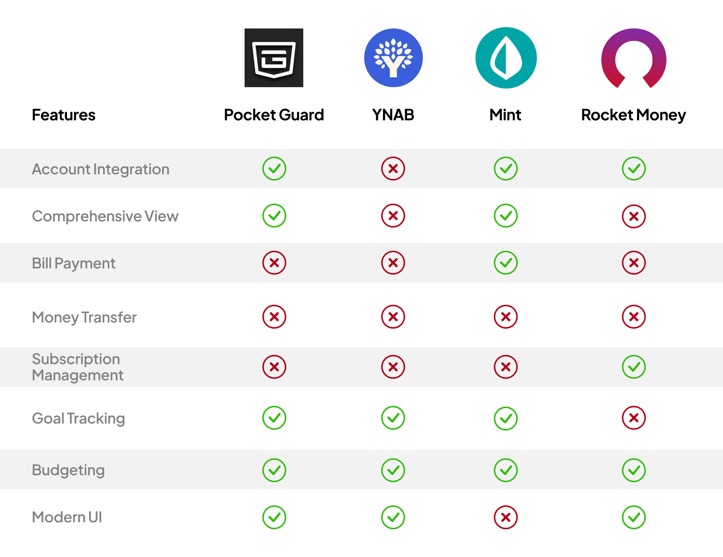
Apps for Market Research: PocketGuard, YNAB, Mint, Rocket Money
Team
Solo Product Designer
(Academic project in association with MS-HCI at RIT)
Role
User Researcher
UX Designer
Product Strategiest
UI Designer
Interaction Designer
Usability Tester
People aren't bad at money. They're bad at juggling five apps at once.
PROBLEM DISCOVERY
I observed the working class individuals (18-45 years of age) for their financial habits and through this initial observation and secondary research, I found that these individuals relied on multiple apps to manage their finances and still struggled to keep up.
To deeply understand user challenges in managing personal finances, I conducted research with a comprehensive, mixed-method approach combining qualitative and quantitative methodologies. All the three methods used pointed to one clear signal.
This approach also later helped inform key product decisions.
Interviews, surveys, and desk research - all pointed to the same friction: fragmentation and cognitive overload.
GENERATIVE RESEARCH
*Sample findings from survey data collected using Google Forms from 20 participants.
✦ 18/20 participants said they were dissatisfied with the current tools available at their disposal.

✦ 14/20 participants said they used at least 3 different apps to manage their finances.

*Sample findings from semi-structured interviews with select participants from the pool.
“Sometimes, I don’t realize how much I’ve spent until the end of the month. I need something that helps me stay on top of my cash flow in real-time.”

Participant 1, 32 yr/o
“Looking at my spending history is overwhelming— there’s no clear way to understand where my money is going.”

Participant 2, 35 yr/o
But wait....didn't a solution already exist in the market?
I used ChatGPT and Google Scholar (for finding published papers) to search for the most popular personal finance apps available in the market. After I identified the top 4 apps, I analyzed them to understand the feature landscape and how they were implemented in the real world. I wanted to ascertain if there were any gaps that could be addressed.
Analysis of 4 most popular personal finance apps showed that no single app combined all key needs of the users.
COMPETITIVE ANALYSIS
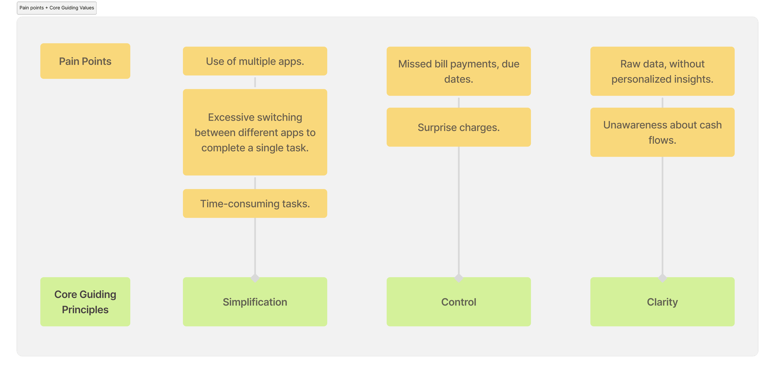
Armed with insights from primary and secondary research, I narrowed down areas of concern to specific pain points and defined design values that became the foundations that informed design decisions at every step henceforth.
These also ensured that the product strategy and every decision remained grounded in user needs.
Collating problem areas & defining design principles helped establish the product vision.
CORE GUIDING VALUES
I drafted a broad problem statement addressing the pain points and keeping in mind the established guiding principles.
DESIGN CHALLENGE

How Might We
design an intuitive solution that transforms the way users manage their finances offering simplicity, clarity and control in a single seamless experience?
By analysing the data gathered through research, a clear primary user emerged: Emily, a 28-year-old professional who is financially aware but financially fragmented. Emily cares deeply, but the tools available make it too hard to stay on top of things.
Tracing Emily’s journey proved to be crucial as it revealed opportunities to address pain points, alleviate fragmentation, and, ultimately enabled me create a better experience for the target users.
Contact me via Email ↗ to know more about the persona I created.
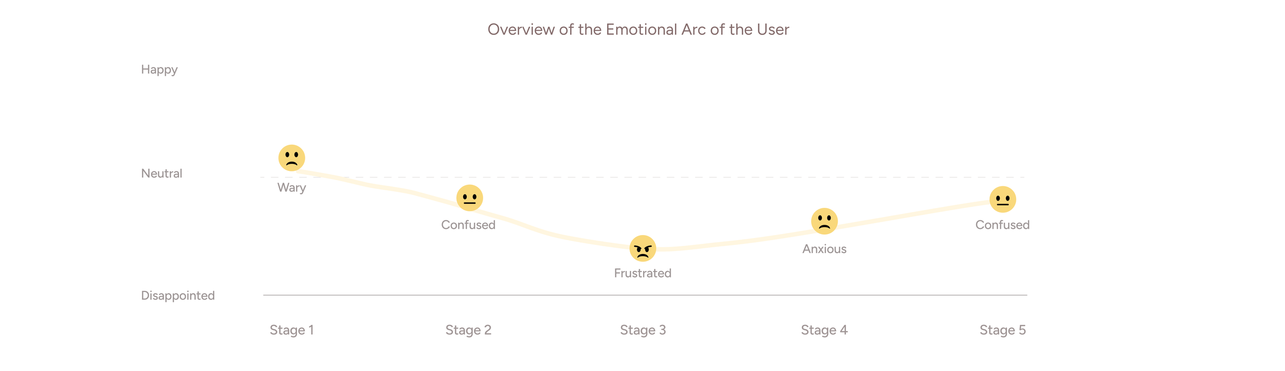
The following journey map shows a single use case — paying electricity bill before Thrive existed. Every stage in the journey is manual, fragmented, and anxiety-laden.
Understanding the exact moments where managing money breaks down — and for whom.
PERSONA + USER JOURNEY MAP

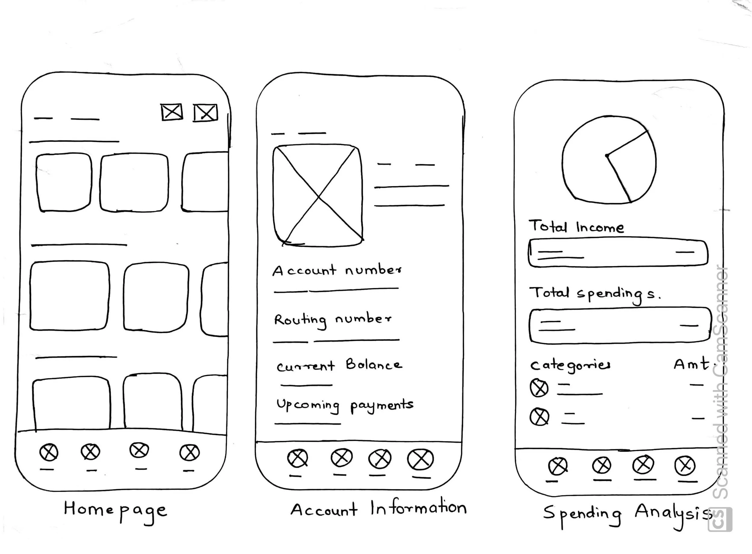
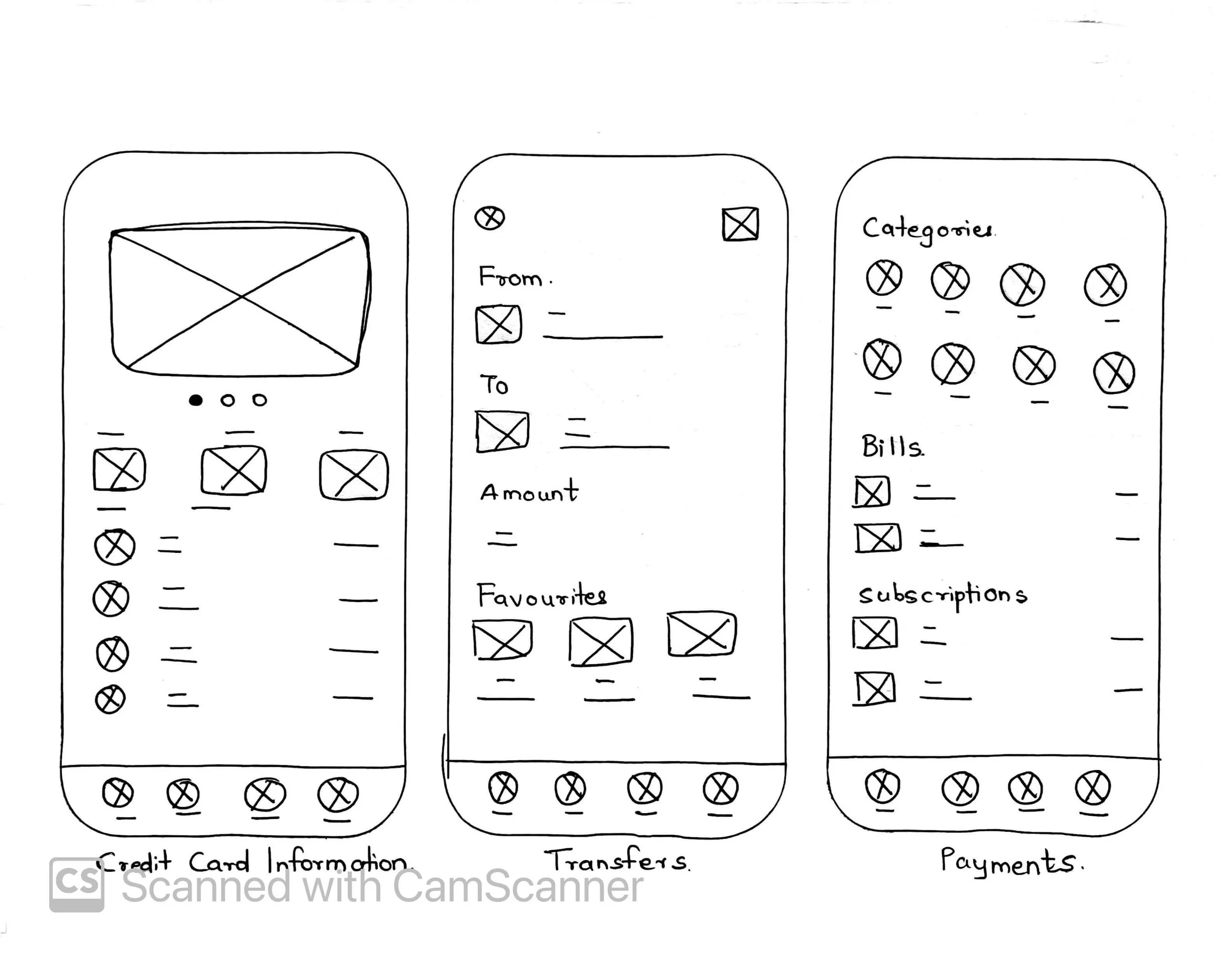
With a design direction, I moved to ideation and design exploration. I used rapid sketches to explore how Thrive’s key features could connect across the app. This helped me think through task flow, screen priority, and information hierarchy before moving into mid-fidelity prototypes. The sketches made it easier to compare early ideas quickly and avoid locking into a layout too soon. This step also helped me evaluate how much information users needed upfront, where key actions should live, and how to keep frequent tasks easy to access without overwhelming the home screen.
Rapid sketching early concepts of the app’s core tasks.
IDEATION, SKETCHES & RAPID PROTOTYPES
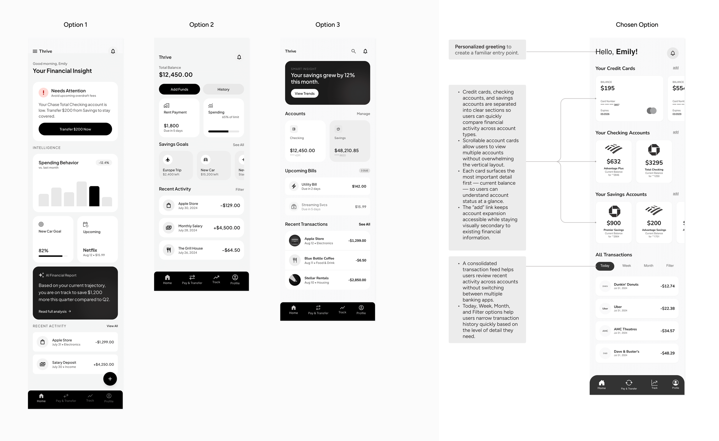
I also wanted to visualize how the key functionalities would be integrated into the app’s core screens, so I took them a step further and translated them into low to mid-fidelity prototypes.
I mapped out user flows for every core task. The goal was that no critical action should take more than 3 taps from the home screen. The home screen became the most debated surface — it went through 3-4 iterations before landing on a layout that prioritised quick account access without burying insights.
Structuring the experience and determining product behaviour with mid-fi prototypes.
MID-FIDELITY PROTOTYPES
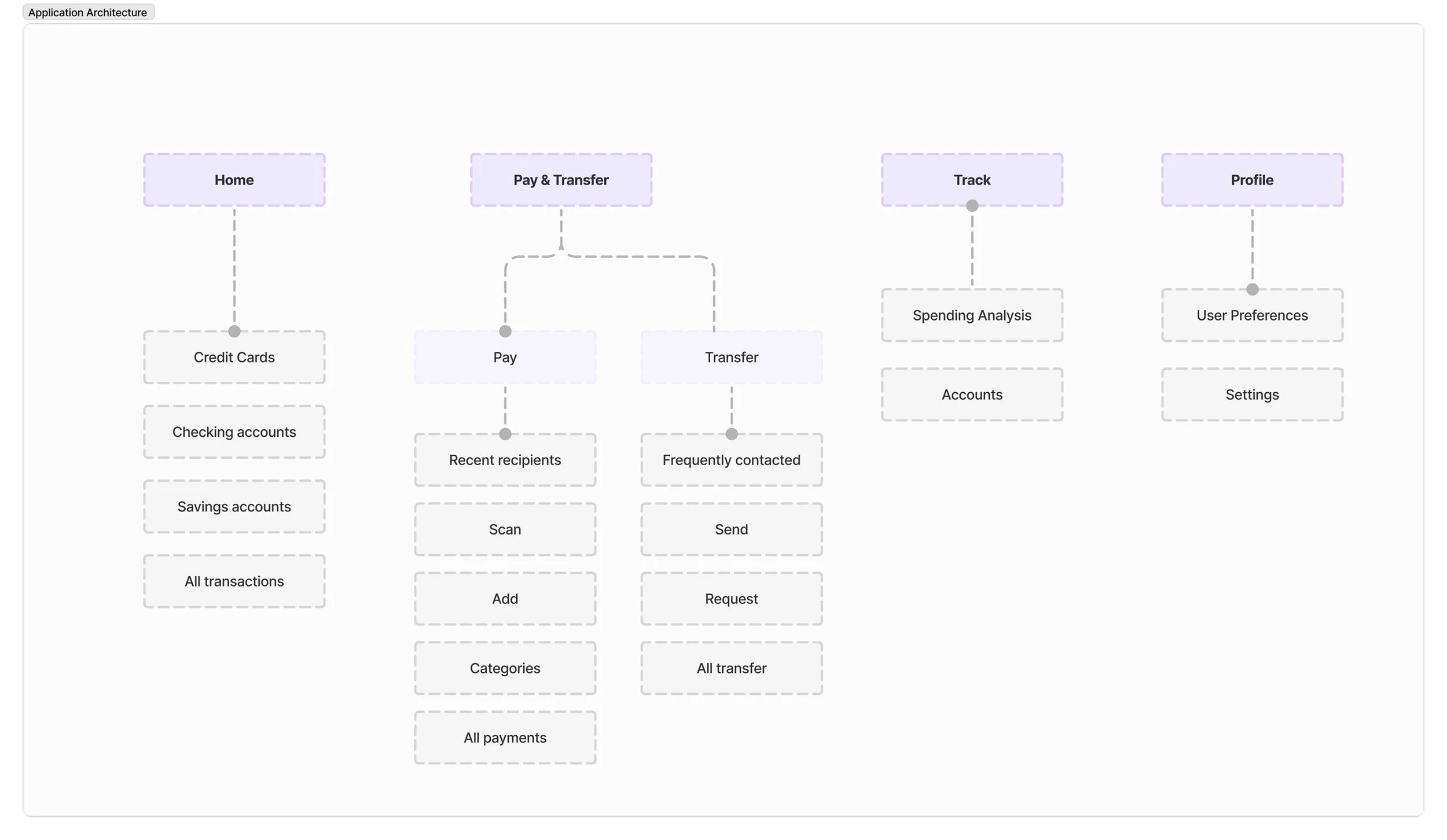
Based on user needs and market gaps, I prioritized features that directly reduced fragmentation and supported everyday financial decisions. The MVP focused on clarity first — not adding every possible finance feature, so I intentionally deprioritized budgeting, goal tracking, and subscription management for the first version to avoid unnecessary feature complexity.
This structure was designed to reduce context switching and make money management feel more direct. It also helped keep the app focused and made the most frequent financial tasks easy to access.
Pivot: Restructuring the experience around 4 core tasks: view, pay, transfer, track.
INFORMATION ARCHITECTURE
The visual language was a conscious reaction to the anxiety most people feel around finance apps. The neutral base — white, grey, black — creates the calm of a well-designed bank statement. Neon accents are used sparingly: for CTAs, live balance figures, and insight callouts. The result is a UI that feels modern and alive without feeling overwhelming. Typography is tight, spacing is generous, and interactive elements are immediately legible.
Professional calm meets deliberate energy.
VISUAL STYLE GUIDE
The final prototype focused on three high-priority user flows: viewing all financial accounts in one place, transferring money to a contact, and setting up recurring bill payments. These flows were chosen because they directly addressed the biggest user needs from research — reducing app-switching, avoiding missed payments, and making frequent financial actions easier to complete with confidence.
Bringing clarity, control, and confidence into everyday financial tasks.
FINAL SCREENS
A faster way to send money without leaving the app.
The transfer flow keeps peer-to-peer payments simple by combining recipient selection, amount entry, account choice, notes, and confirmation into one clear sequence.
Helping users stay ahead of bills before they become stress points.
A complete financial snapshot, with details one tap away.
A unified home screen helps users understand their financial status at a glance, while account detail pages keep deeper information accessible without overwhelming the dashboard.
Recurring bill setup gives users more control by turning repeated payments into a one-time setup, reducing the risk of missed bills and unexpected charges.
After refining the key flows, I tested the prototype again to evaluate usability improvements. The final version reduced task time, lowered navigation errors, and improved task completion and satisfaction across core finance tasks.
Round two of testing showed that the refined prototype was faster, clearer, and easier to complete.
RESULTS AND IMPACT
20%
Reduction in Average task completion time
Average task completion time decreased from 42 seconds to 34 seconds, suggesting that users could move through key flows more efficiently after the design refinements.
20%
Increase in task completion rate
Task completion improved from 87% to 100%, showing that users were able to successfully complete the tested flows without additional guidance.
10%
Reduction in Navigation Errors
Navigation errors decreased from 3% to 1%, indicating that clearer labels, stronger hierarchy, and more visible actions helped reduce confusion.
40%
Increase in User Satisfaction
The average satisfaction score increased from 3.5/5 to 4.85/5, suggesting that the final prototype felt easier, clearer, and more confidence-building for users.
95%
Stated Adoption Intent
In addition to usability metrics, I asked tested participants whether they would download and use Thrive if it were available. 19 out of 20 participants said yes, resulting in a 95% stated adoption intent
REFLECTIONS & LEARNINGS
✦ Balancing Complexity
One of the most important learnings was to avoid ‘feature creep.‘ It was tempting to keep adding the ‘nice‘ features like goal tracking, subscription management, budgeting, especially after seeing so many possibilities via ideation and competitor apps. This taught me the value of saying no to unnecessary layers and complexity. By not cramming every possible feature, I delivered a cleaner, more usable product.
NEXT STEPS
✦ Conduct Longitudinal and Attitudinal Research
Test Thrive with users over a longer period, such as 1–2 weeks, to see whether they continue using the app for repeated tasks like checking balances, tracking spending, and managing recurring payments.
Measure how users feel before and after using Thrive — especially around financial clarity, confidence, and stress. This would help validate whether the app improves emotional confidence, not just task completion.
✦ Explore Post-MVP Features
Once the core flows are validated, I would revisit features that were intentionally deprioritized, such as budgeting, savings goals, and subscription management, to understand which ones add the most value without overwhelming the experience.